Staphylococcus coagulans is a coagulase-positive, Gram-positive coccus of the family Staphylococcaceae, typically arranged in clusters. It has been isolated from animals and animal-derived products, and despite its coagulase-positive phenotype it is distinct from Staphylococcus aureus based on molecular typing. S. coagulans has a moderately sized genome and its coagulase gene shows sequence divergence from the classical S. aureus coagulase, aiding species-level differentiation.
The thresholds for this species may be unreliable due to a low number of reference genomes included in the analysis.
For detailed methods on how these thresholds were calculated, please see Methods. The suggested thresholds are in the table below. These thresholds are based on 0 genomes from RefSeq and 103 genomes from other sources.
These tables provide a summary of the distribution of each metric, including SDeviation, Mean, Median, and Percentiles.
These thresholds were applied to all the bacteria dataset. The list of genomes retained (i.e. high quality) and the list of genomes rejected (filtered) can be downloaded below. These files are in .xz format. The rejected genomes file also includes the reason why.
| Metric | Lower bound | Upper bound |
|---|---|---|
| N50 | 71,000 | - |
| no_of_contigs | - | 120.0 |
| GC_Content | 36.00 | 36.00 |
| Completeness | 99.00 | - |
| Contamination | - | 1.000 |
| Total_Coding_Sequences | 2,000 | 2,500 |
| Genome_Size | 2,200,000 | 2,600,000 |
This plot shows the relationship between the number of coding sequences (CDS) and genome size. It helps to visualize how genome size correlates with the number of genes. This should be linear – as genome size increases, the number of coding sequences should also increase. Any secondary trend lines or non-linear behaviour indicates bona fide separate populations within the retained genomes or some remaining contaminant.
A table of complete RefSeq genomes for Staphylococcus coagulans used to calibrate this scheme. The file includes accessions, some sample information, genome size, GC content, and other key metrics.
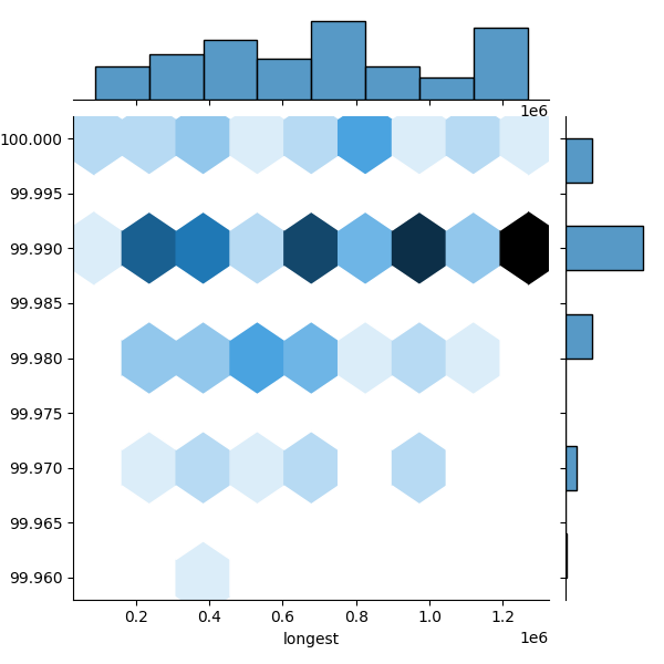
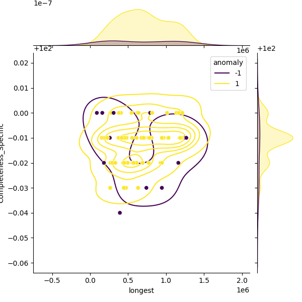
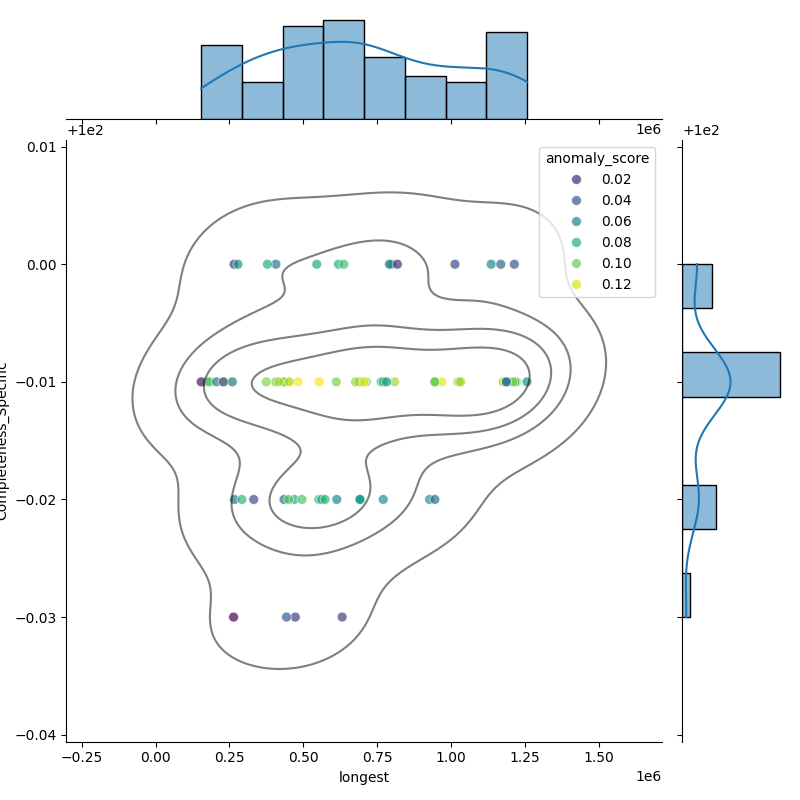
These plots show genomes before and after filtering to highlight the outliers removed. Left: Heatmap of all genomes in the dataset. Middle: A representative sample of genomes, with anomalies highlighted (purple). Right: The filtered distribution after applying filtering. There may have been additional adjustments and rounding so the distribution here may not enirely match with the final suggested metrics.