These tables provide a summary of the distribution of each metric, including SDeviation, Mean, Median, and Percentiles.
| Metric | Lower bound | Upper bound |
|---|---|---|
| N50 | 38,000 | - |
| no_of_contigs | - | 310.0 |
| GC_Content | 56.00 | 58.00 |
| Completeness | 98.00 | - |
| Contamination | - | 3.000 |
| Total_Coding_Sequences | 4,900 | 6,500 |
| Genome_Size | 5,200,000 | 6,500,000 |
This plot shows the relationship between the number of coding sequences (CDS) and genome size. It helps to visualize how genome size correlates with the number of genes. This should be linear – as genome size increases, the number of coding sequences should also increase. Any secondary trend lines or non-linear behaviour indicates bona fide separate populations within the retained genomes or some remaining contaminant.
Histogram comparing SRA to RefSeq; each bar shows genome density across value ranges to highlight shifts, peaks, or outliers.
QQ (quantile-quantile) plot comparing SRA and RefSeq. Points along the diagonal follow the expected distribution; deviations indicate skew, outliers, or other systematic differences.
A table of complete RefSeq genomes for Klebsiella variicola used to calibrate this scheme. The file includes accessions, some sample information, genome size, GC content, and other key metrics.
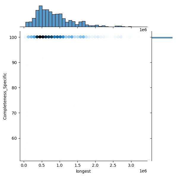
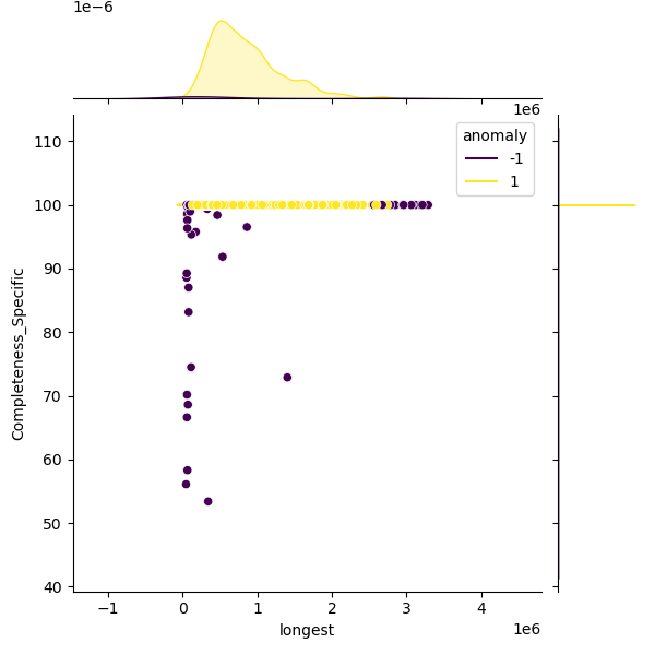
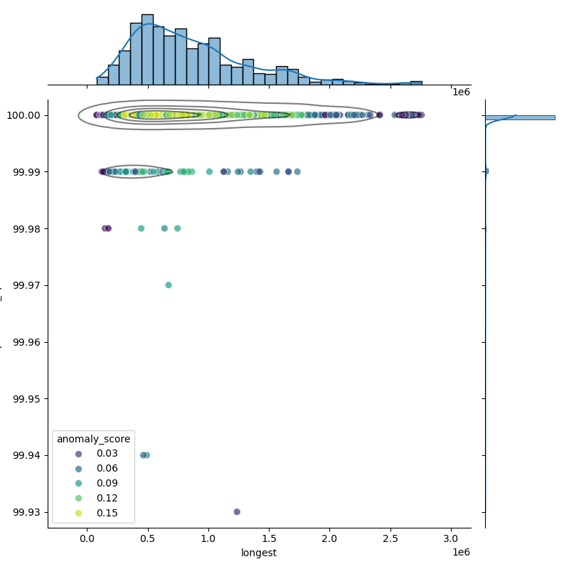
These plots show genomes before and after filtering to highlight the outliers removed. Left: Heatmap of all genomes in the dataset. Middle: A representative sample of genomes, with anomalies highlighted (purple). Right: The filtered distribution after applying filtering. There may have been additional adjustments and rounding so the distribution here may not enirely match with the final suggested metrics.